Ági Cosmetics
COMPLETE REBRANDING
After the needs assessment, we personally visited the salon to experience the atmosphere, and spirit of the cosmetics in order to gather inspiration for creating a self-identified identity.
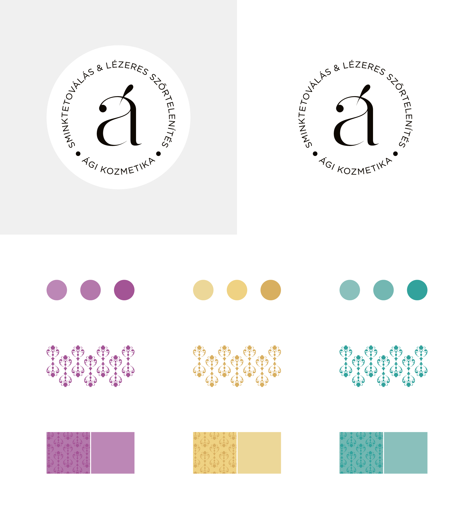
Logo & Brandboard
Typographic logo
pure elegance
In the previous logos of Ági Cosmetics, one of the tools used in cosmetics (e.g.: tattoo head) always appeared in some drawn form to represent the service. According to our experience, this strong reference is not necessary in all cases. In the spirit of renewal, we created feminine elegance and premium category by making a typographic logo.
Color harmony
together and yet separate
The salon’s services can be divided into three main areas: cosmetics, laser hair removal and make-up tattooing. When creating the color harmony, we took the interior into account, which is how the cosmetics got that shade of purple, which is refined and discreet in itself – thus positioning. When defining the other two colors, we took the triple color harmony as a basis. All three colors are direct colors (Pantone), so there are no unpleasant surprises for us even when used in printing. In the case of laser hair removal, we chose yellow, while for make-up tattooing, we chose green.
Salon-like textures
unity and harmony
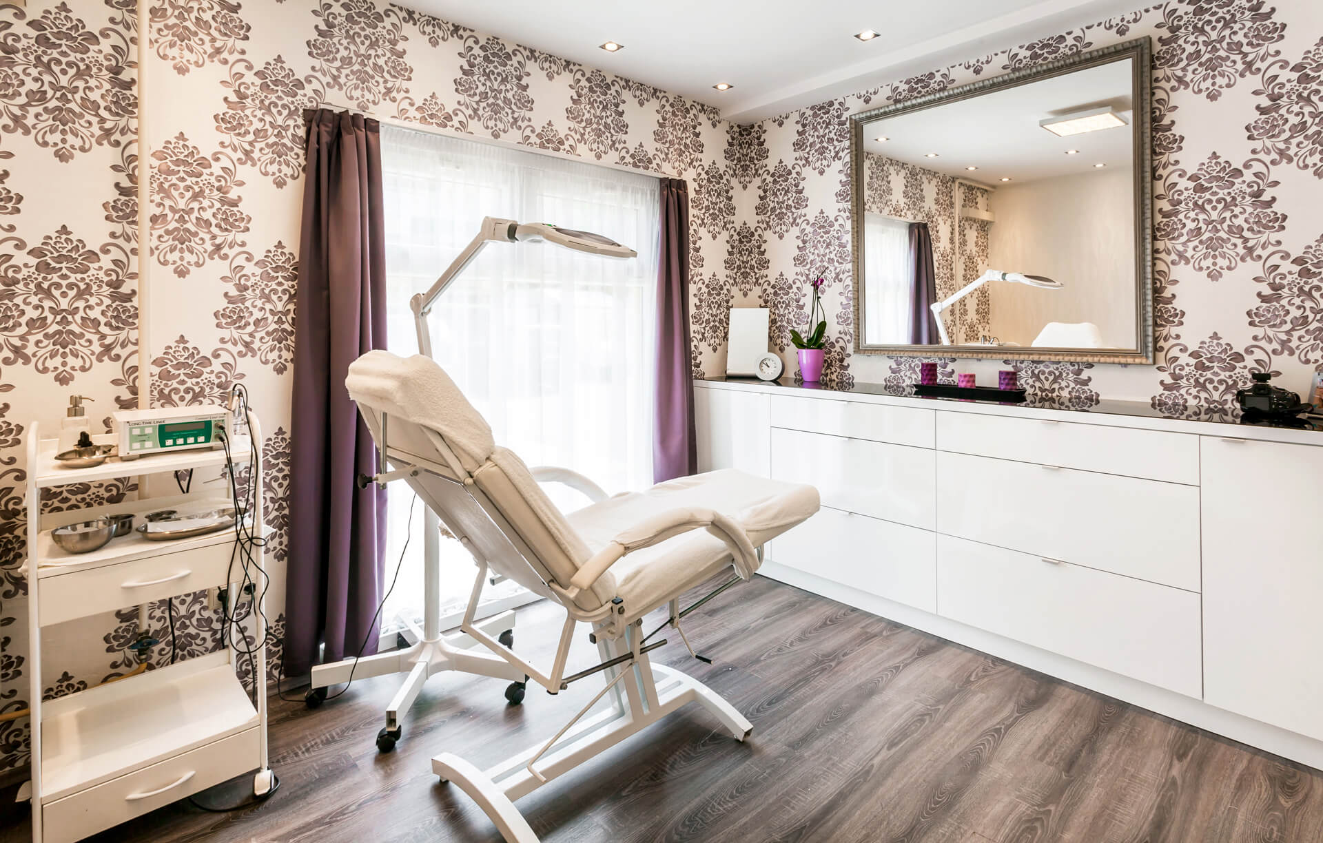
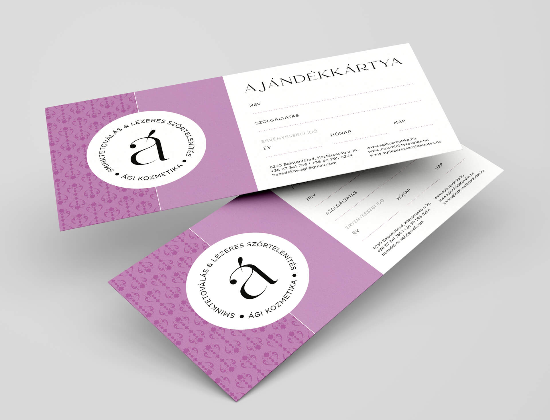
For the visual appearance, we felt the need to use a feminine texture, which you can not only find online and on printed materials, but also appeares on the walls of the salon.
Typography
feminine lines
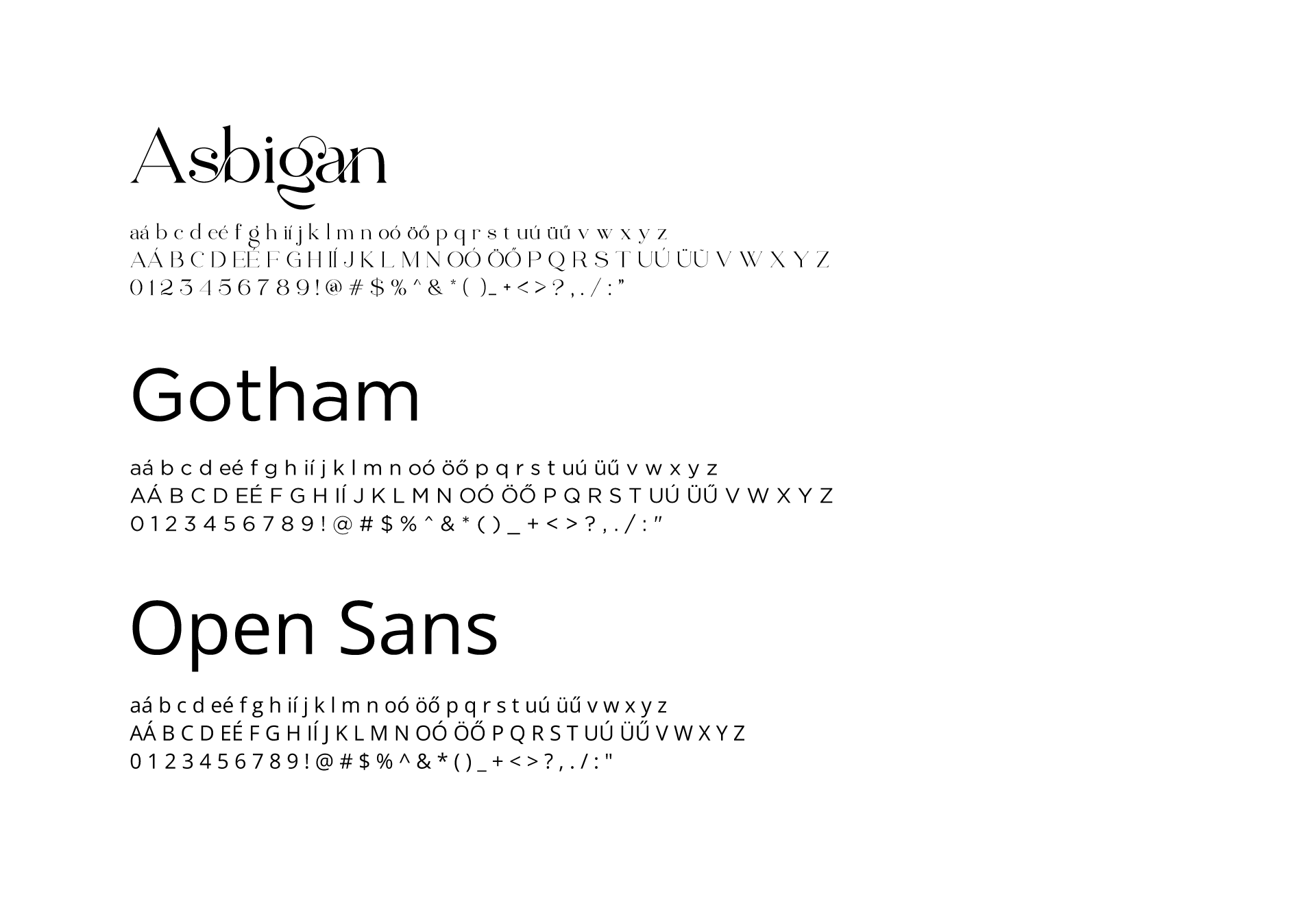
Complying with the typographical rules, we used a geometric font for the body of the text both in print and online, while in the title – using letter mixing – we used an elegant serif type with feminine lines.
Printed materials
Business cards
basic pieces with thorough design
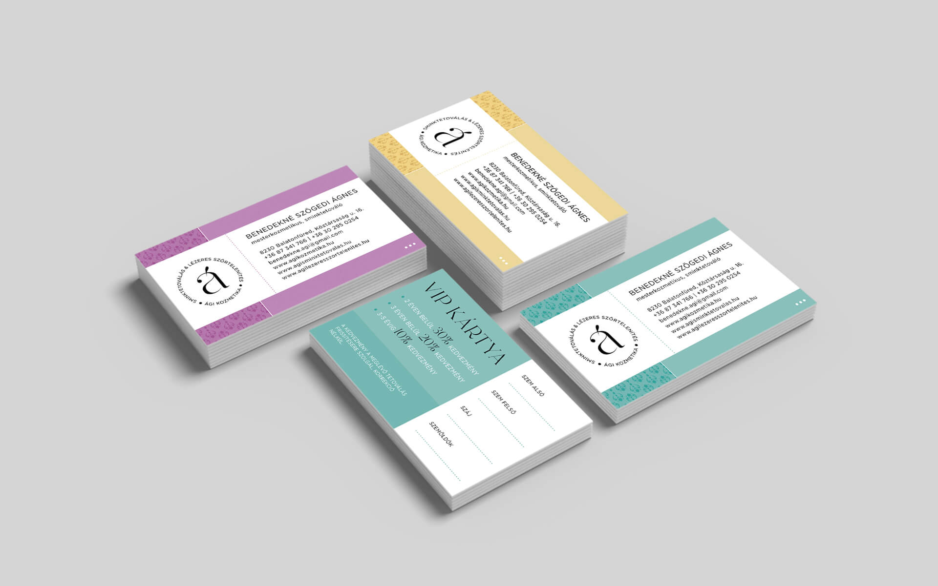
Even in the world of online publications, there are also basic printing products that are indispensable in business life. At Ági Cosmetics, we designed separate business cards for both the store manager and the employees, and differentiated them according to the type of services. A business card says more about you than you think, so its design should not be taken lightly. It is important that it should fit in the brand, should not contain too much information without unnecessary graphic elements. In addition to the business cards, a VIP card was also created, especially for the guests coming for the make-up tattoo.
Glass foil
repackaged salon
As we wrote earlier, the salon has become more exclusive every year as a result of continuous professional development. The old glass foil featured cosmetic services that have since been pushed out of the cosmetics business due to the emergence of new technologies. Due to the dynamic development of the beauty industry, it was an understandable request on the part of our client that specific services should no longer be listed on the new foil. We were specifically asked to work with minimized content and graphics.
Web & online publications
Website
silky softness on your display
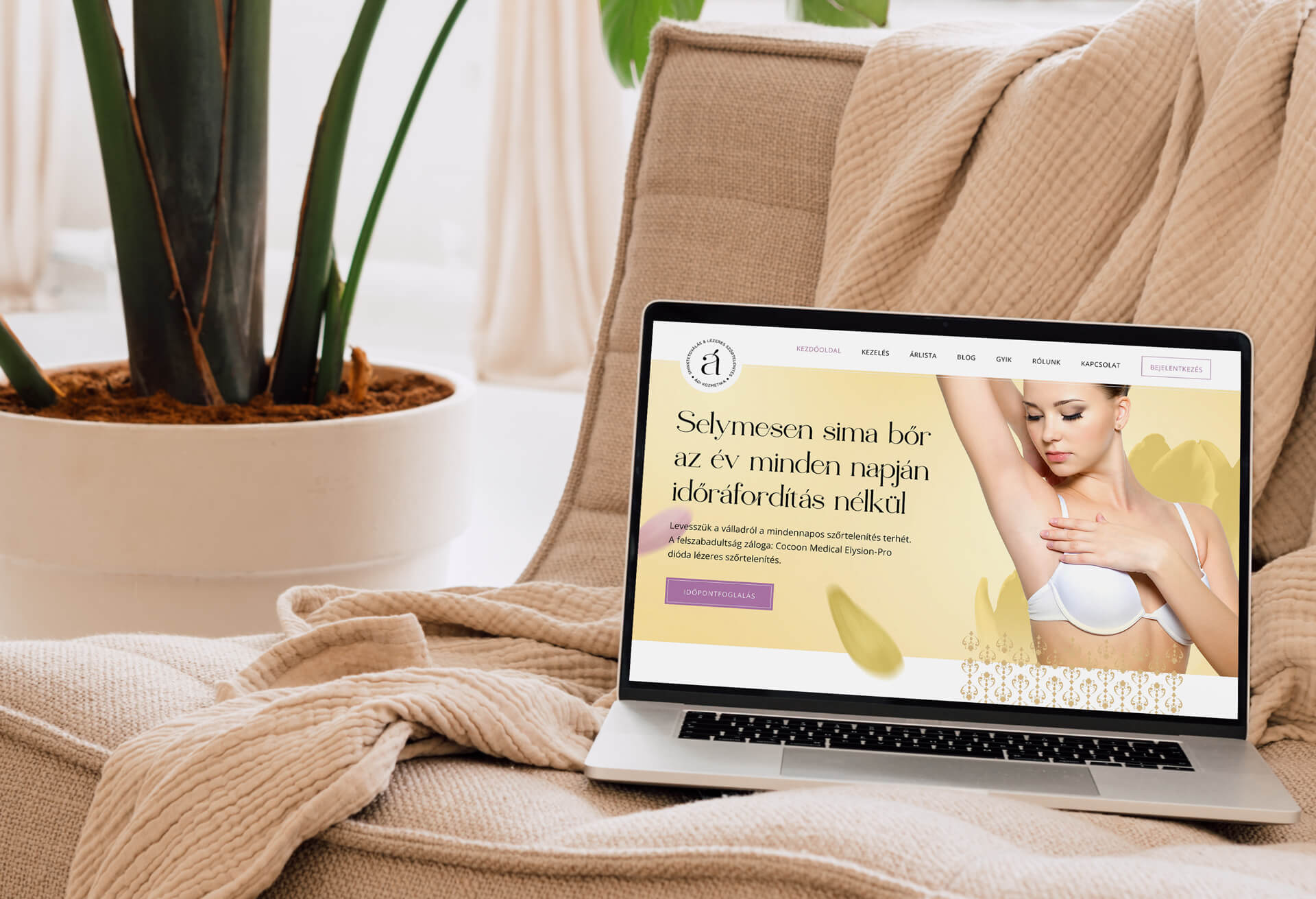
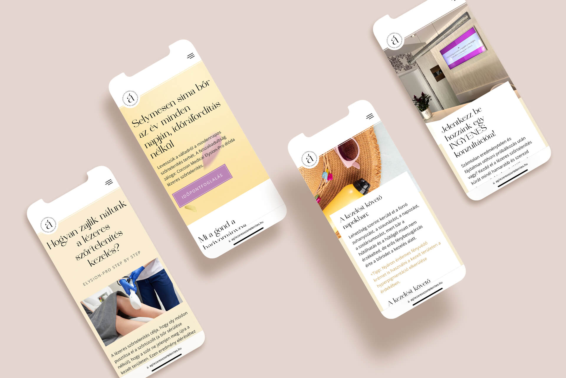
The three separate services have three separate websites, so there was no question that the triple color harmony would appear on the online interface as well. In the first round, laser hair removal got a new look. The softness smuggled into the yellowish color scheme already creates a feminine atmosphere on the main page. As the topic of hair removal is quite sensitive, we thought it is important that the effect should not be harsh and distant. True to the Kentaur trademark, everything is “handmade” with individually designed and drawn graphic elements. With this, we not only position ourselves again, but also create trust in the visitor. During the construction of the site, we worked on the basis of two important aspects. One is that the page structure is not determined by a premade template system, but rather by the unique functionality required by the content. Thanks to the latter, the entire side structure is also unique. The other is responsiveness, since we know based on the measured data that the guests visiting the service use mobile devices to a significant extent.
The other two websites of Ági Cosmetics still work with the old identity, which we did not create – they will also be updated in the future according to the new look.
www.agilezeresszortelenites.hu
Other online publications
everywhere at all times
Of course, the renewal of the brand had to appear on social media, so you can see the new logo and cover image on both Facebook and Instagram. The salon takes advantage of the opportunities offered by social media – it draws attention to itself with regular posts and promotions. The images and advertisements created for these surfaces are already created with the new logo and graphic elements, since the work does not end there when the new brand is ready. A wide-spectrum facelift was successfully implemented covering all surfaces, and Kentaur Graphics will continue to be an active part of it in the future.

