PanDora Body-Fit
BRANDING & SMALL IDENTITY & LANDING PAGE
In the case of PanDora Body-Fit, the development of the brand and the equipment of the studio proceeded at the same time, so actually one inspired the other. The aspects of the design of the place went hand in hand with the needs of the branding. Since the quality and nature of the service is much more complex than a general physical activity, it was also important in the appearance to support these as much as possible.
Logo & Brandboard
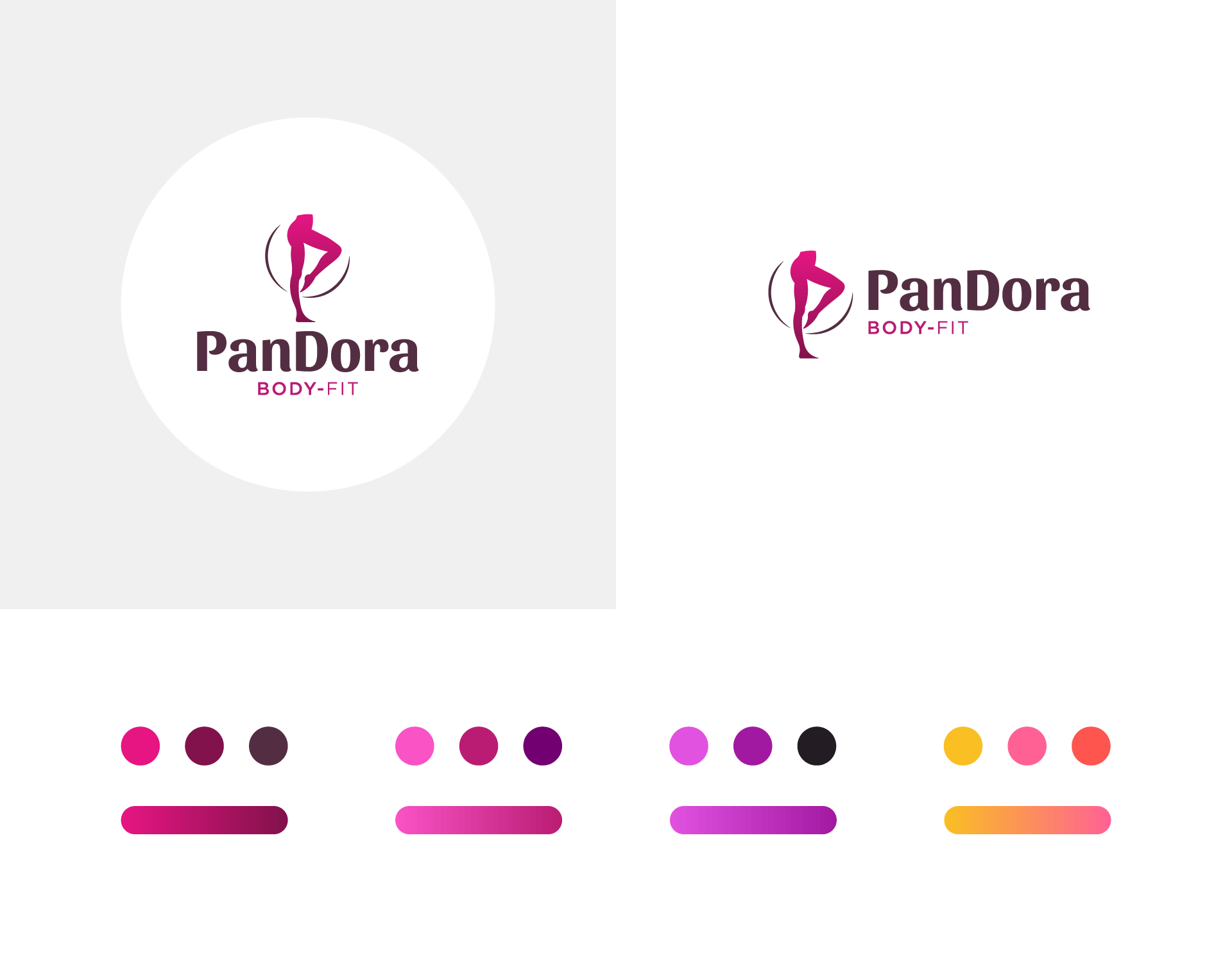
Combined logo
Sportily feminime
The PanDora Body-Fit offers its guests a body shaping machine, so it is actually a kind of service. In this case, we felt it was important to symbolically display the type of movement in the logo. This special form of exercise focuses mostly on the lower body. Like most body shaping machines, the infrared sauna bike is mostly for women. The symbol born in the spirit of sportiness and femininity and the carefully chosen typography in the name of the company form a dynamic unit.
Color harmony
We also set the colors in motion
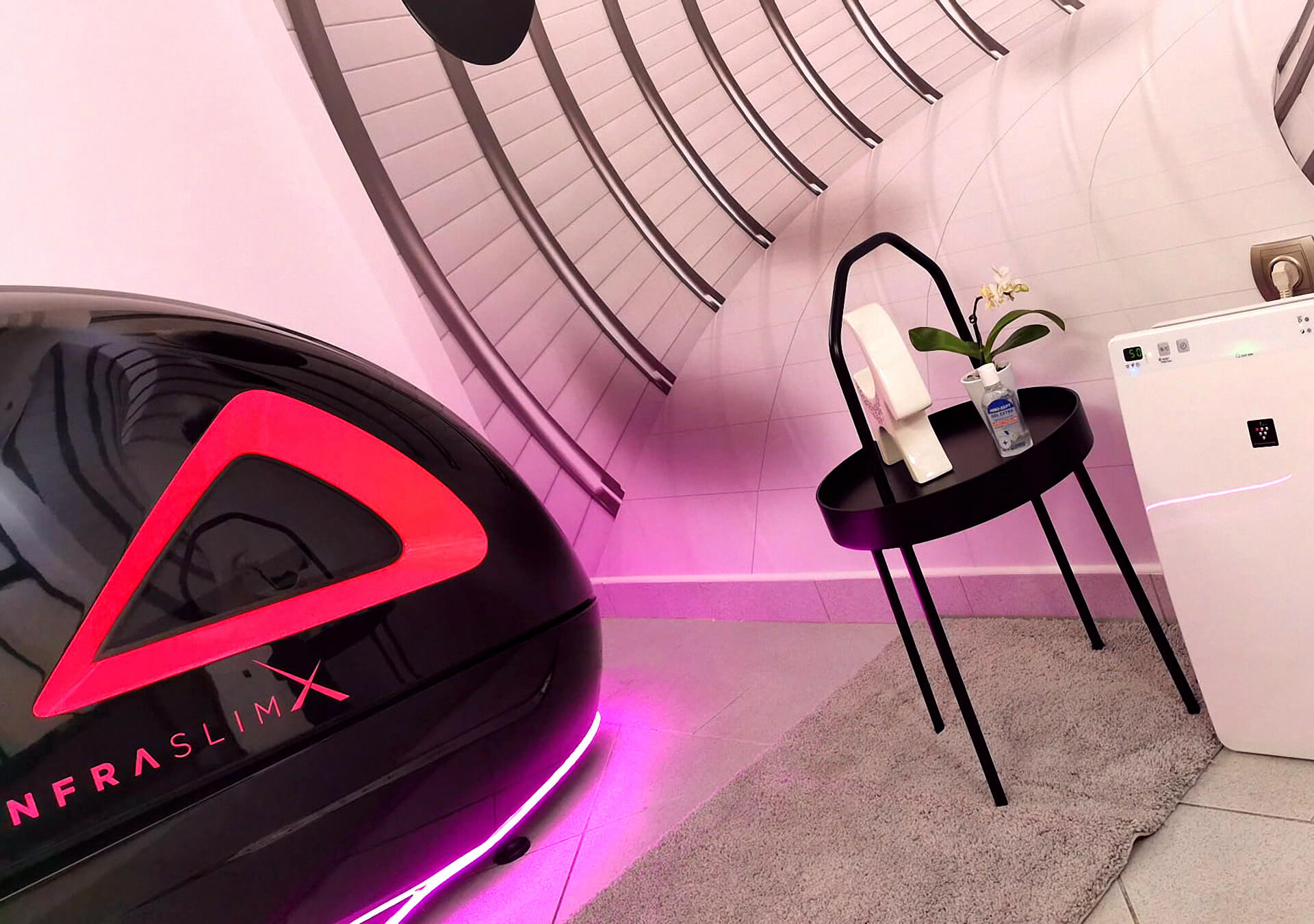
The machine creates a special atmosphere in the studio with pink LED lighting during operation. The infrared sauna bike in black, white and pink, with its modern design, creates a professional effect in itself. When designing the interior of PanDora Body-Fit, the emphasis on this modern appearance and the creation of a combination of fitness and wellness experience were among the considerations. The combination of physical and mental replenishment, balance and movement appears in the colors and color transitions. The pink and orange colors reflect energy, vigor and the PanDora sense of life.
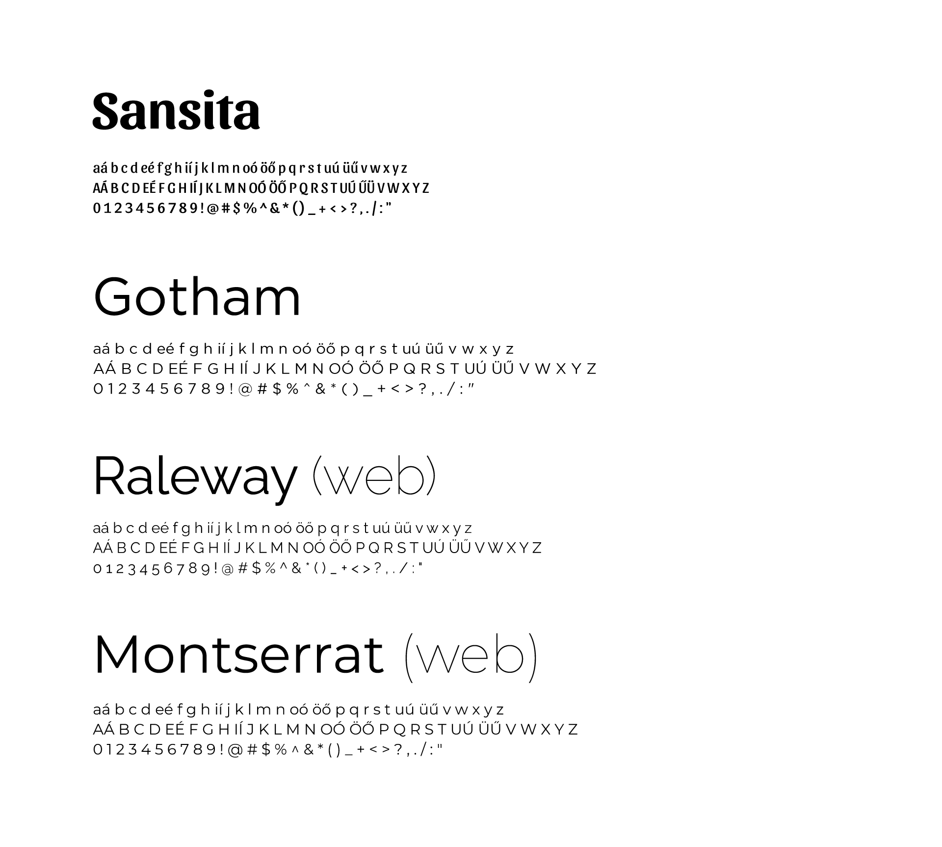
Typography
Unique in form
As for the inscription appearing in the combined logo, we also followed the rules of letter mixing. In the word PanDora, we used a font with calligraphic features that is completely consistent with the motif, while in the text Body-Fit that appears below it, we used a clean, geometric type. The type used exclusively online was also defined separately in the indentity.
Printed materials
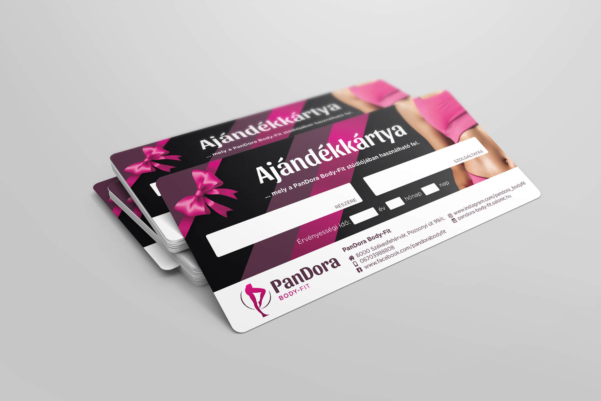
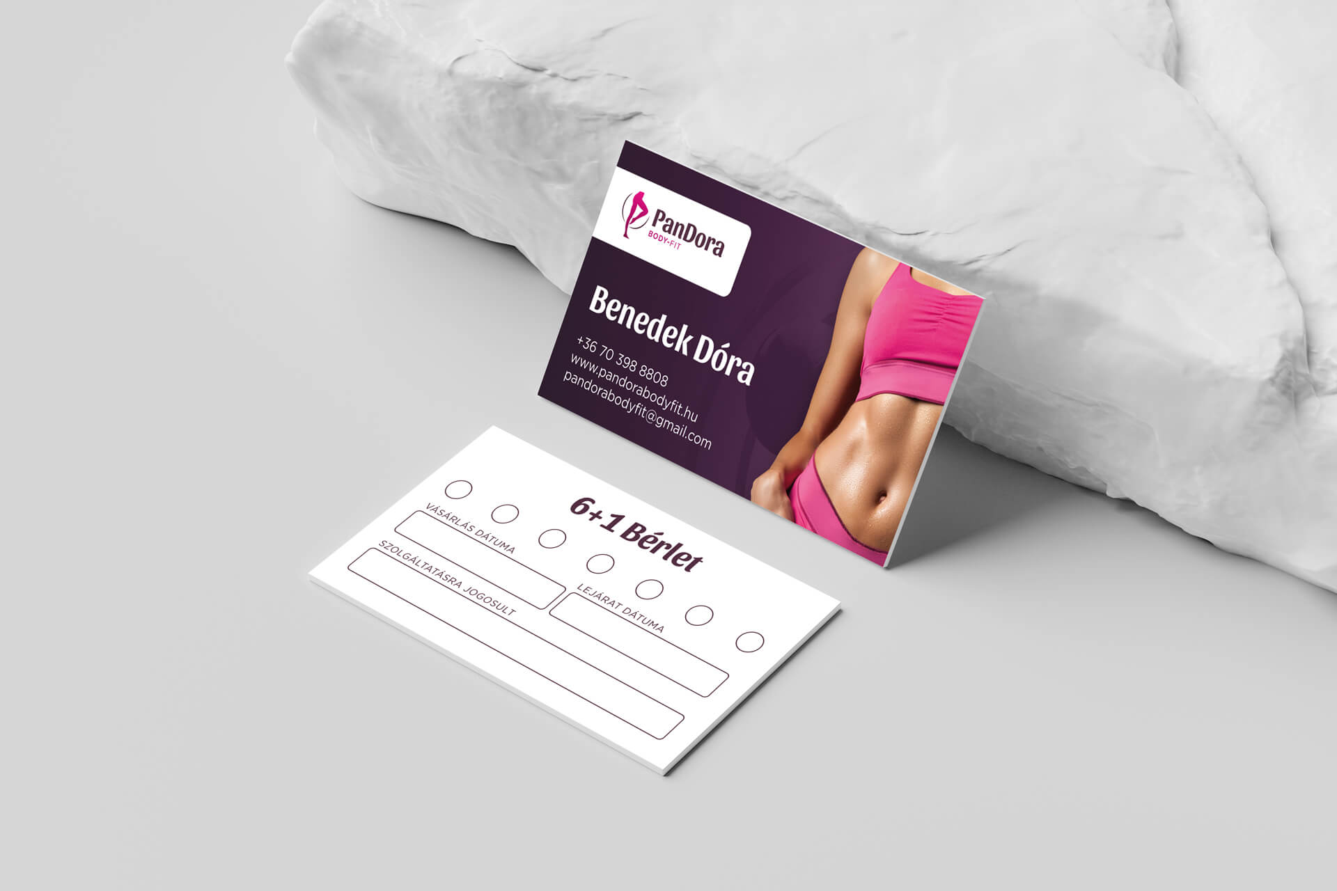
Voucher and pass
Acquired quality
The atmosphere that we created in the brand is also reflected in the printed materials prepared for the guests. In addition to the external design, we also took into account practical aspects (distances, dimensions of fields to be filled in manually, legibility, clean look).
Even in the case of the simplest-looking product, it is important to be faithful to the quality of the service, since every surface with a brand element reveals about you.
Web & online publications
Handmade illustrations
Functions brought to life
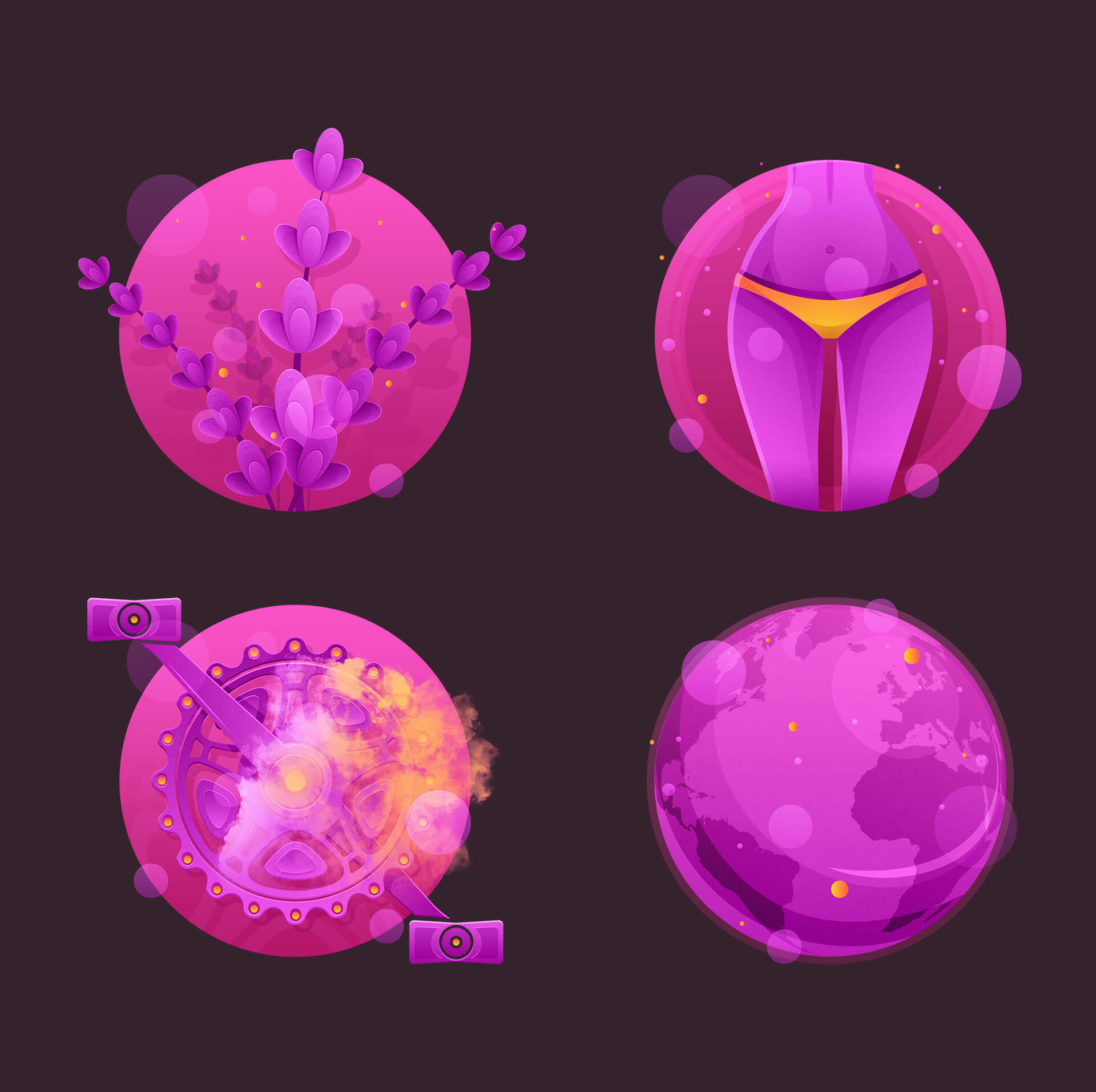
As already mentioned, there is only one machine in the PanDora Body-Fit studio. This one makes the training complex with the complexity of an infrared sauna bike. The possibilities offered by the bike are presented with hand-made illustrations, which not only refer to the specific setting, but also symbolize the magical atmosphere of the salon.
- Aromatherapy: in the case of lavender aromatherapy, with a special representation of lavender, we presented the scent itself in the studio’s typical spherical motif.
- Collagen & light therapy: feminine lines, the play of light and shadow and the sporty, tight shape dominated the creation of the unique illustration.
- Infrared sauna bike: among all of them, this is perhaps the most telling illustration of the brand visuals -pedals, heat, work, energy appear in the motif – one looks at it and almost sweats.
Anyone who has ever visited the PanDora Body-Fit studio knows that the whole place has a kind of mystical atmosphere, which we wanted to convey in all of our illustrations.
- Ozone and oxygen therapy: the immunity-strengthening ozone and oxygen therapy was drawn in the “Pandoraized” version of the Earth, in which air, atmosphere, movement and health are all felt.
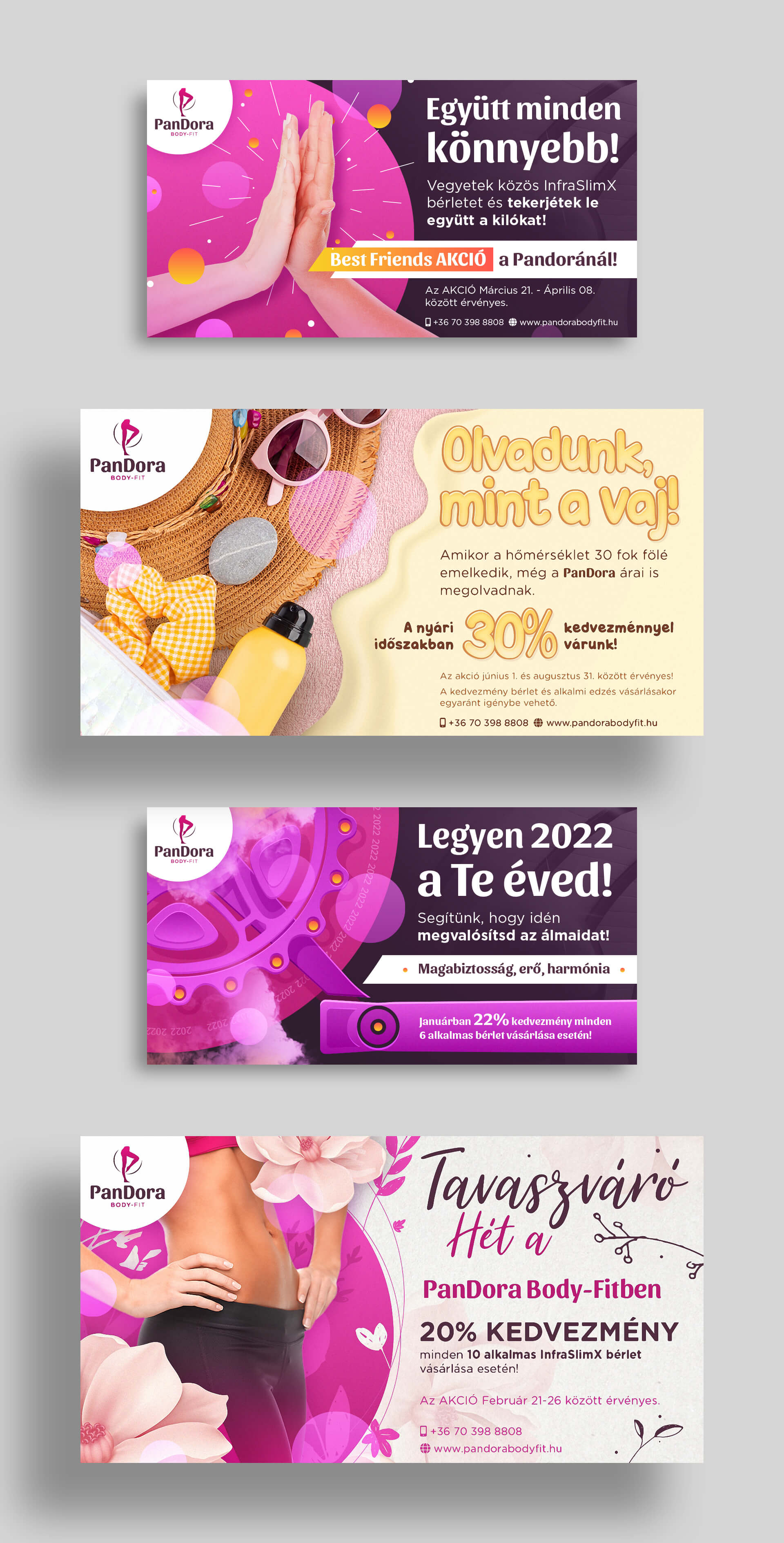
Advertisements on social media
Favorites on sale
PanDora favors its guests with constantly appearing promotions and invitations. We consider it important that the advertisements appearing on social media are also true to the brand, in addition to achieving their goal: to draw attention to themselves. Positive, inviting identity in a unique appearance.
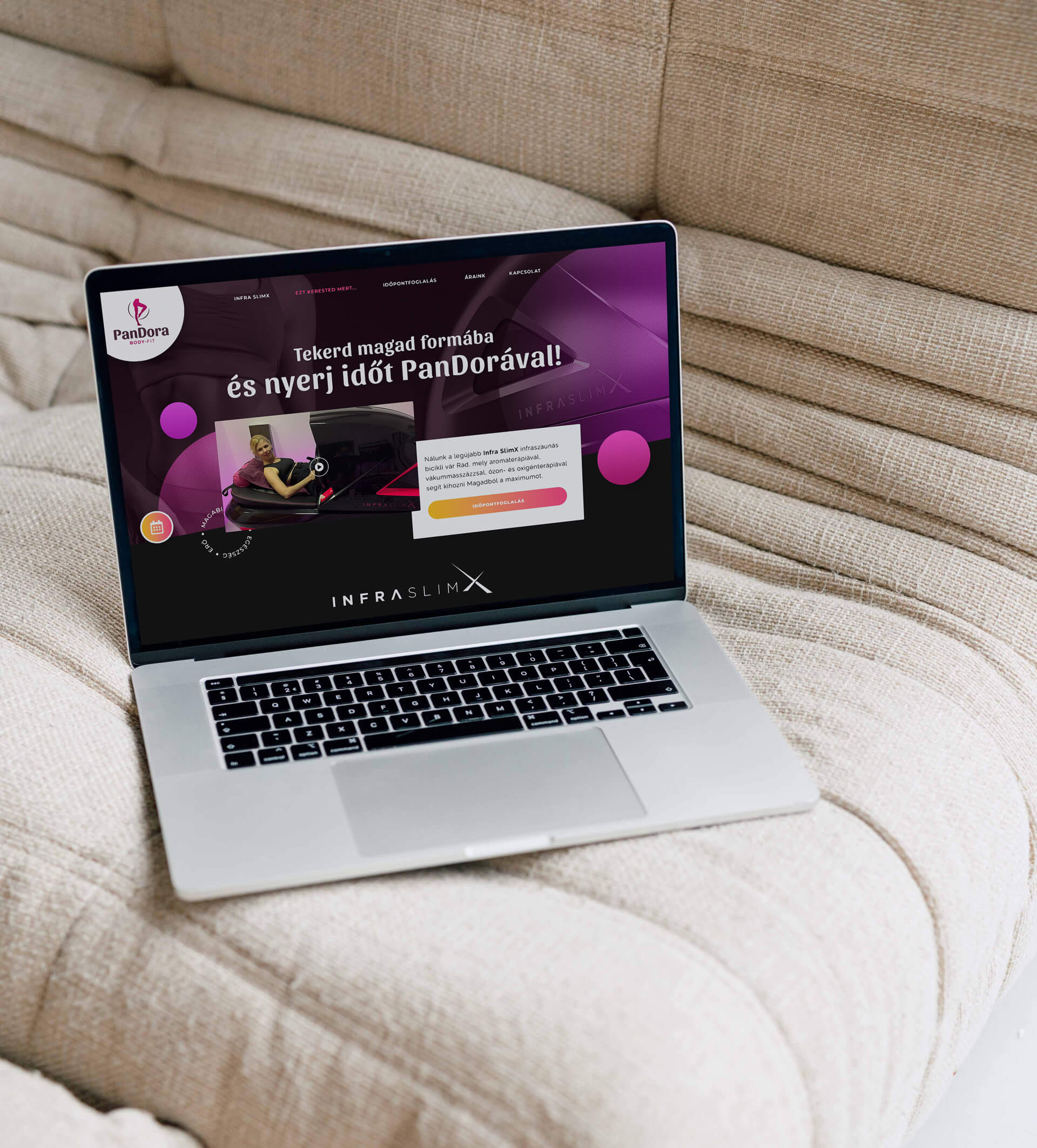
Landing page at maximum
Dynamic elegance
It is a decision to be considered in the life of a business, what kind of website you create for your service. In the case of PanDora, we decided to make a landing page and how well we did! The one-page site was perfectly sufficient to convey all the essential information to the visitor while creating atmosphere, targeting the audience and conveying the friendly, people-oriented atmosphere of the studio. The website is completely identical to the product, the company, Pandora.

